
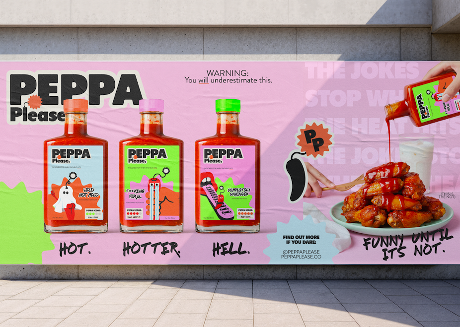
Peppa PleaseA bold, unhinged brand identity for Peppa Please, a hot sauce brand for people who like their food with a kick - and their branding with a sense of humour. Designed to stand out on the shelf, on the table, and online, this brand doesn’t take itself too seriously… until the heat hits.
Scroll to the bottom to explore the thinking behind the refresh.
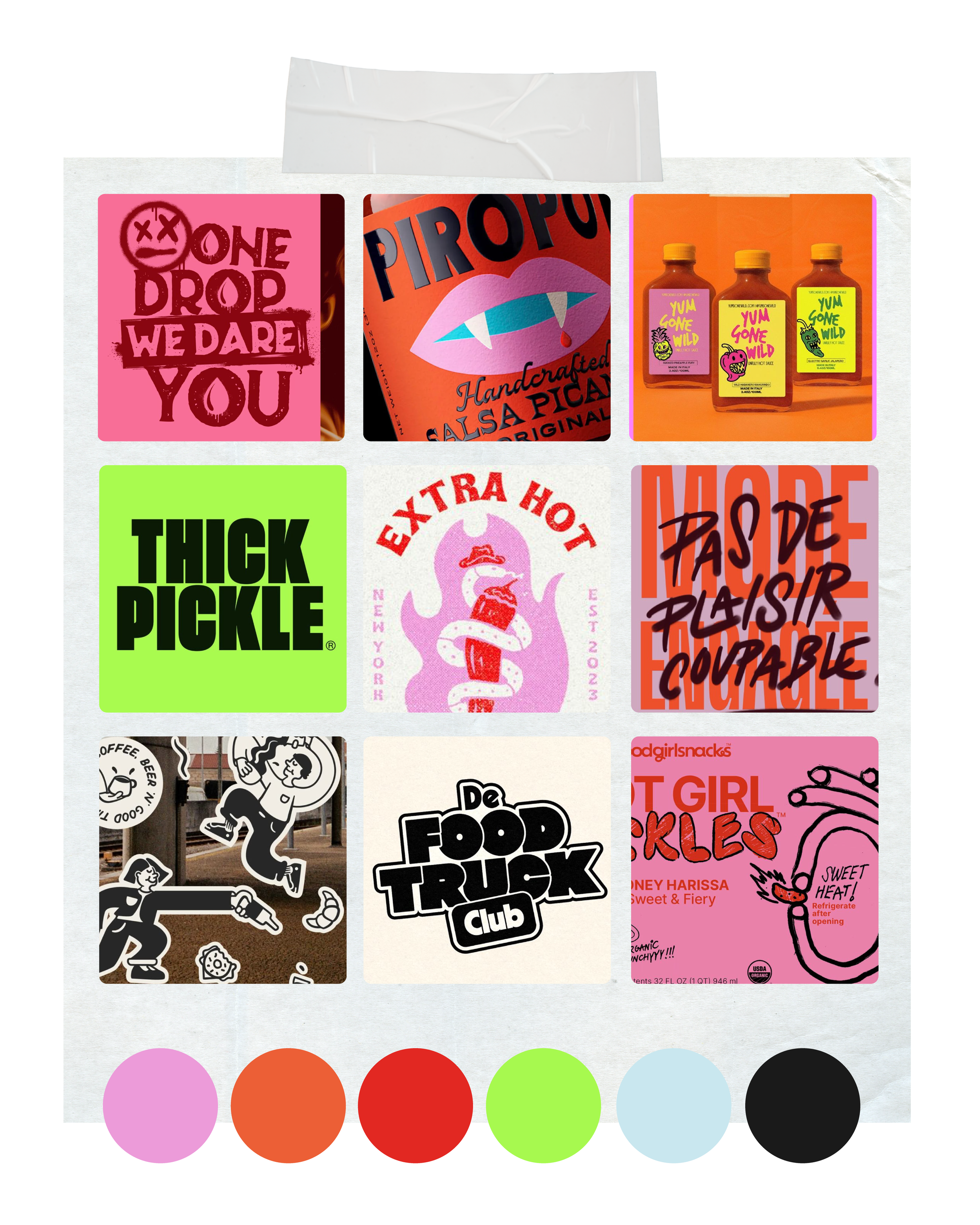
Peppa Please needed branding that felt playful, loud, and instantly recognisable. The goal was to create a brand that looked as hot as it tasted - packing real heat, real ingredients, and zero blandness. It had to appeal to flavour-lovers who enjoy chaos, confidence, and a bit of mischief with their meals.
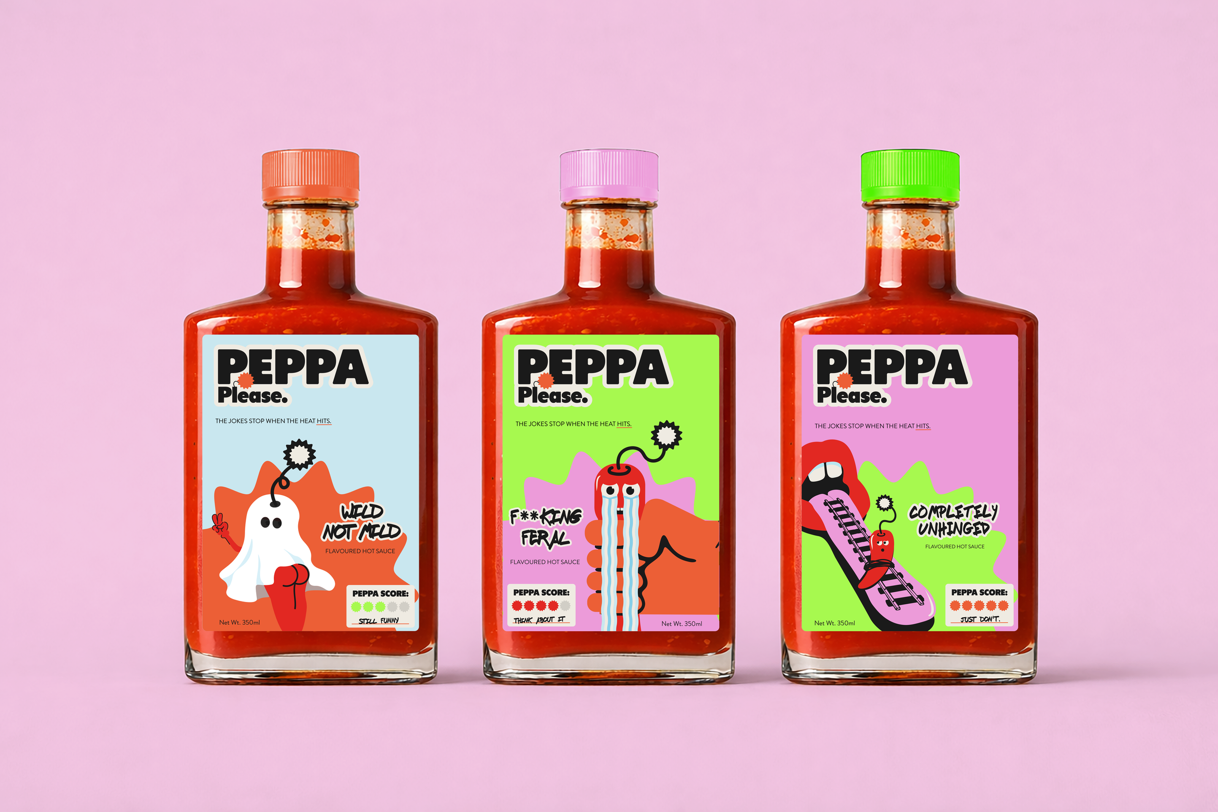
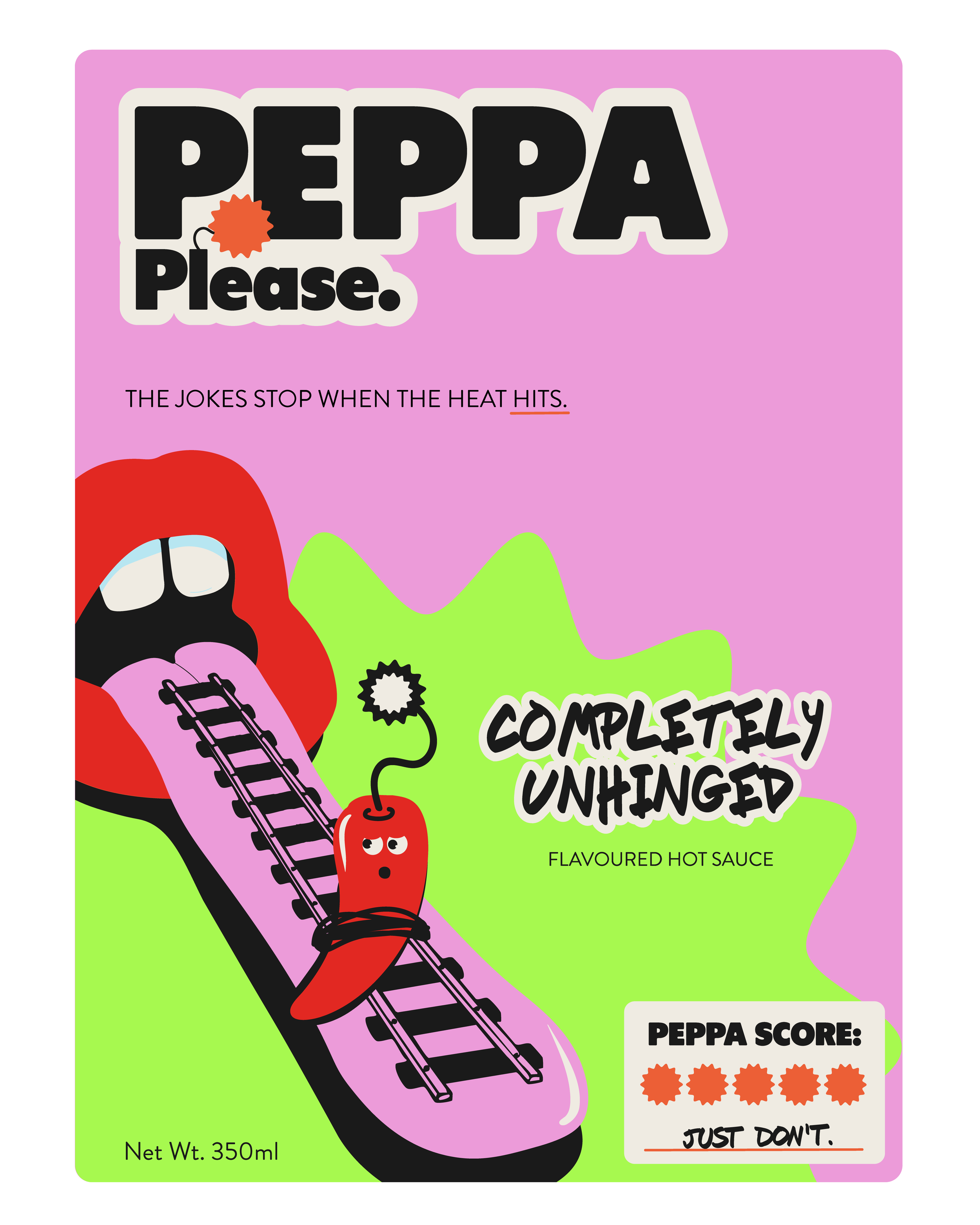
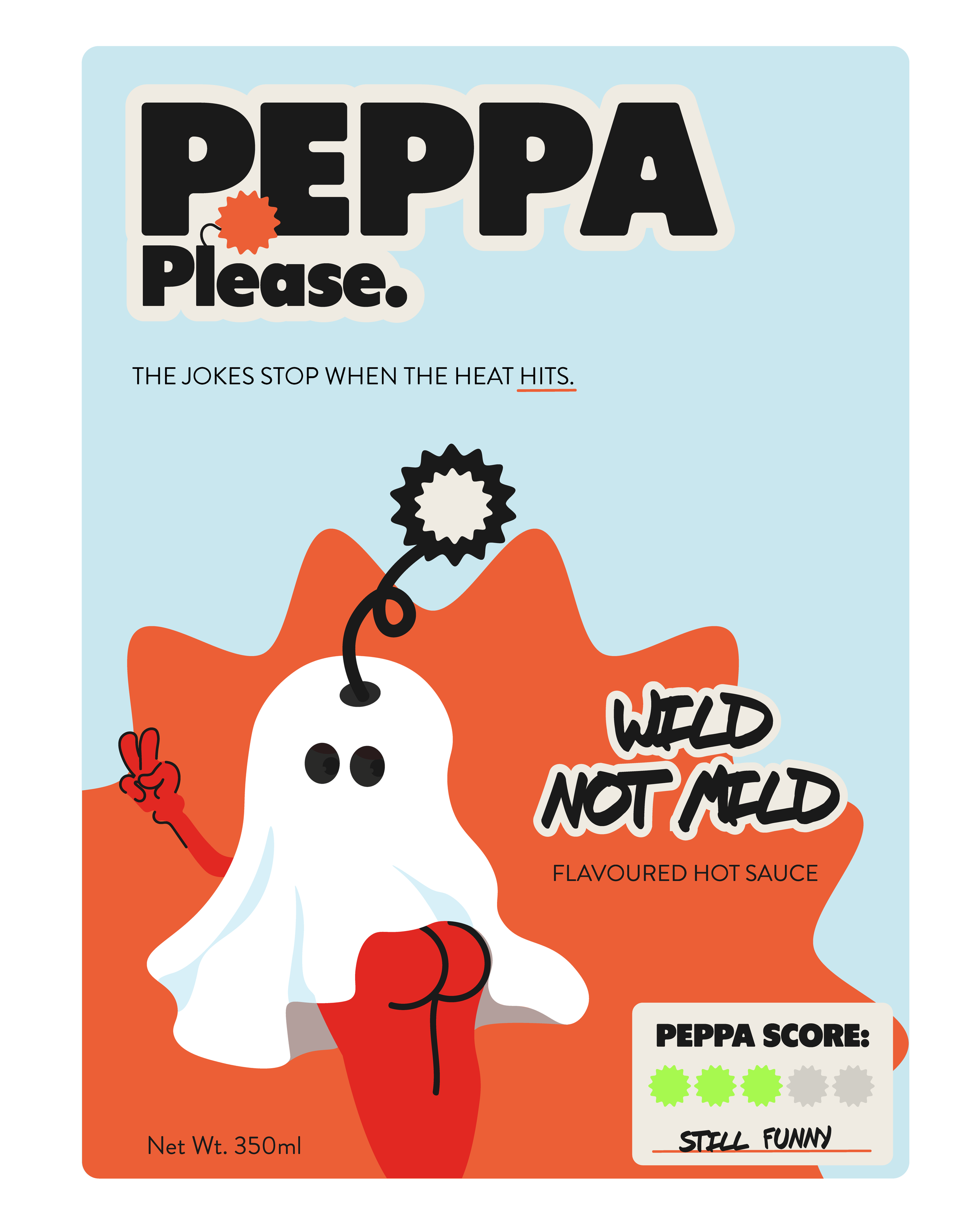
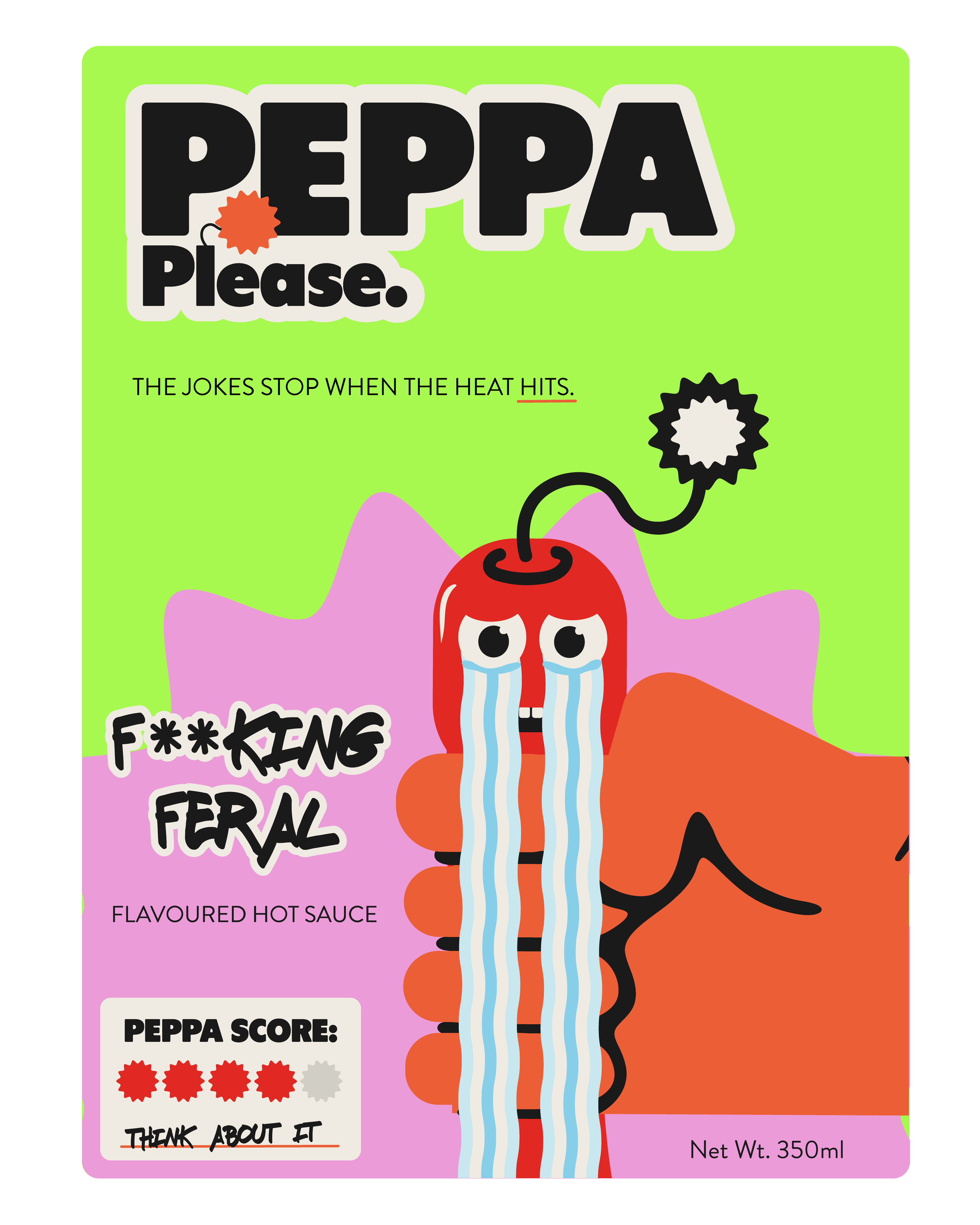
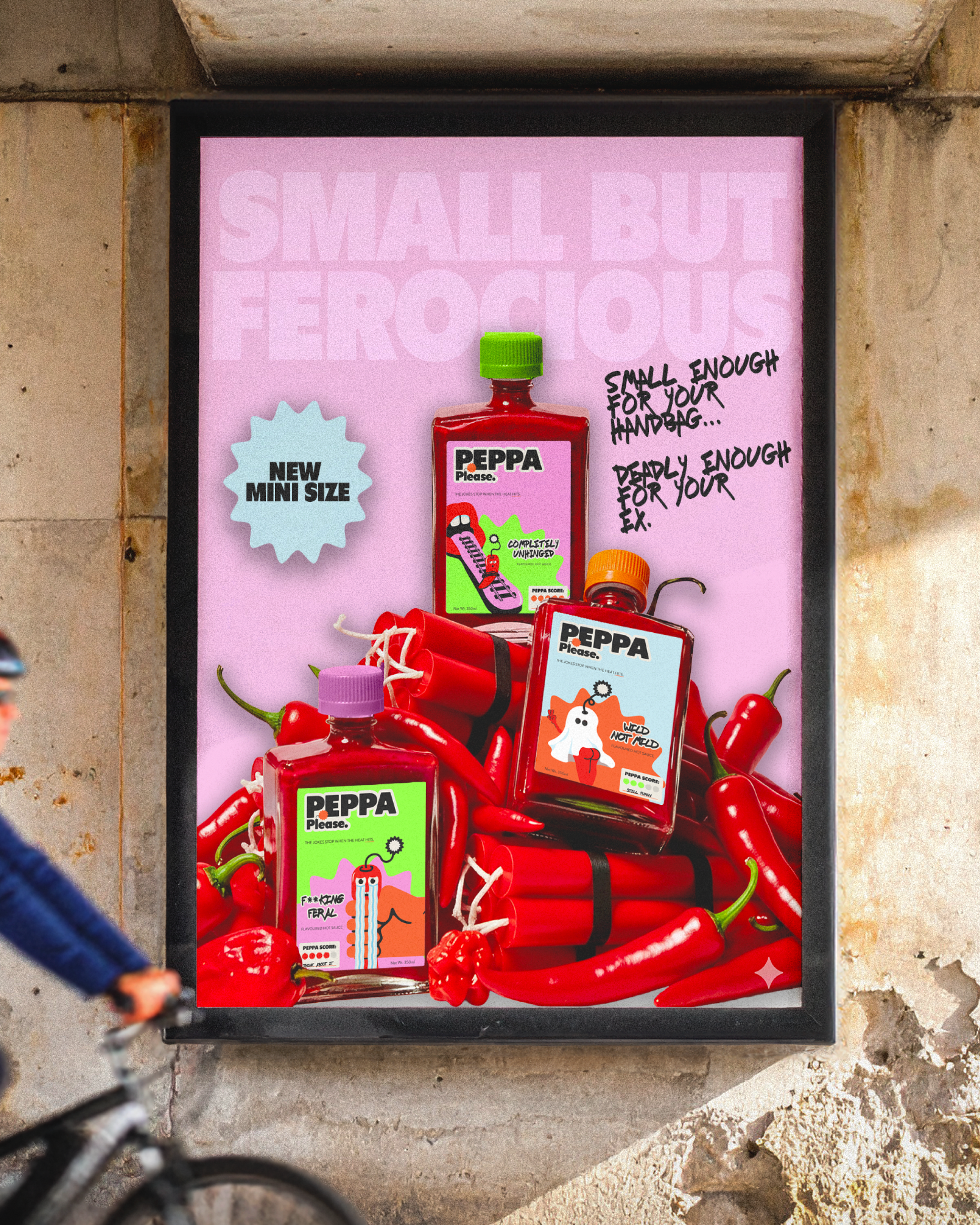
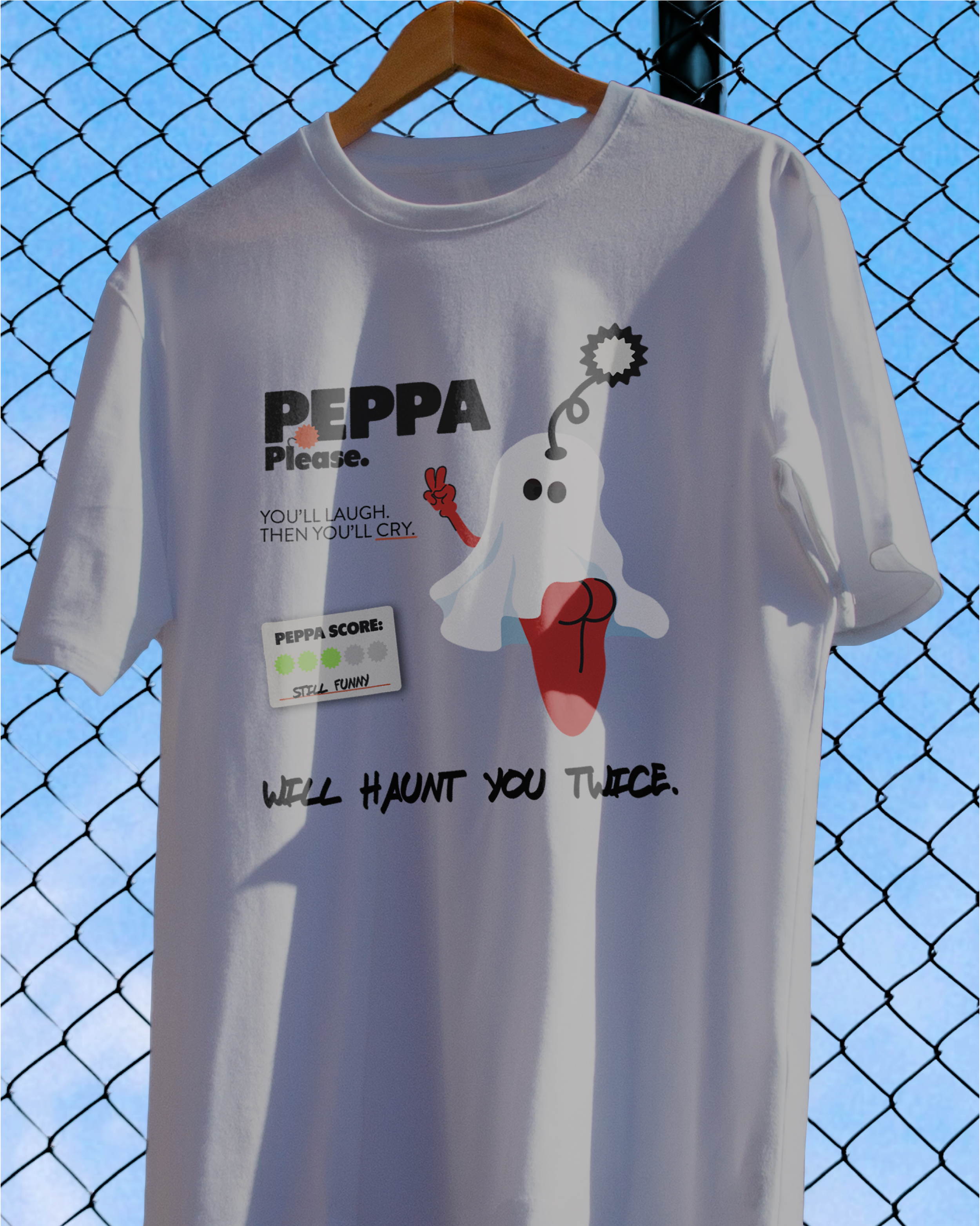
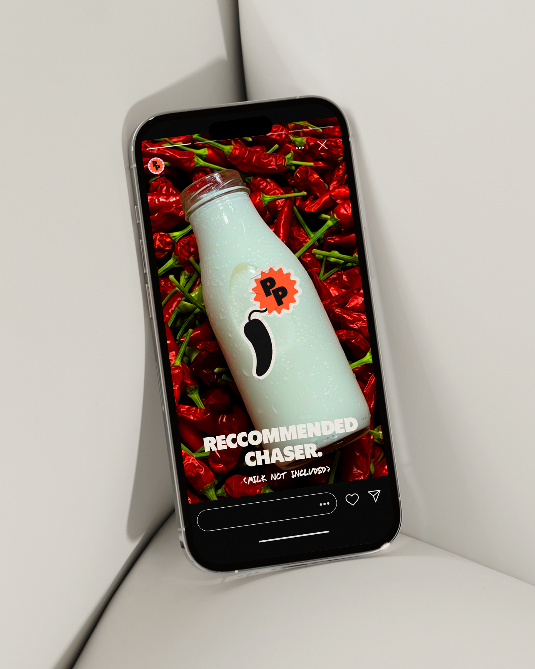
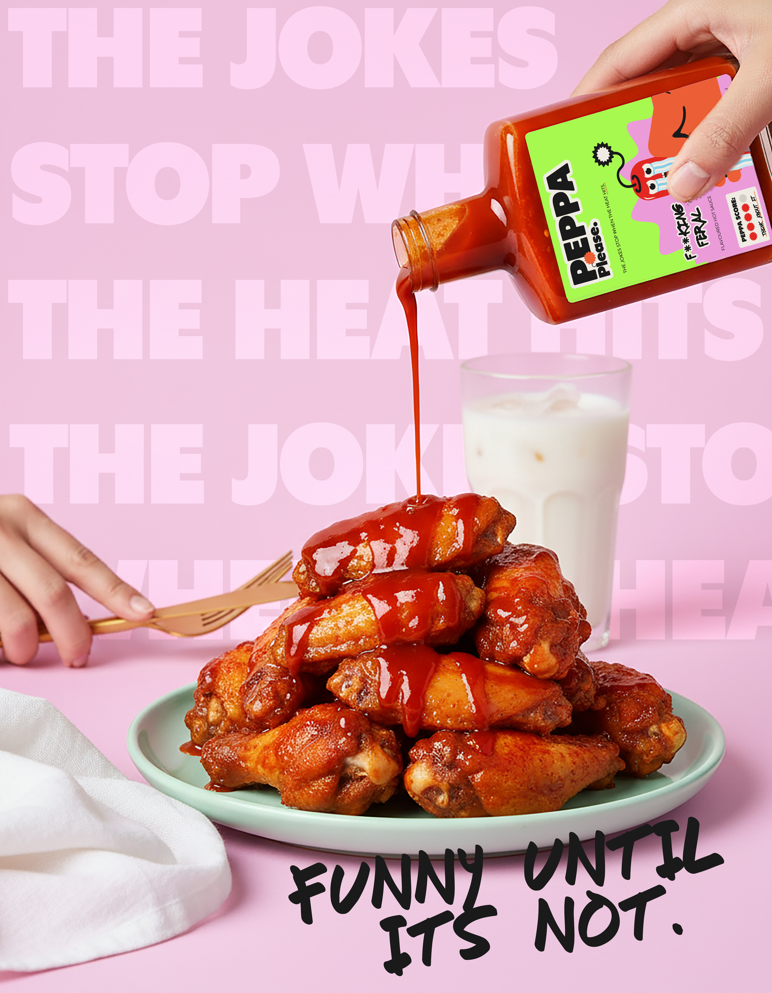
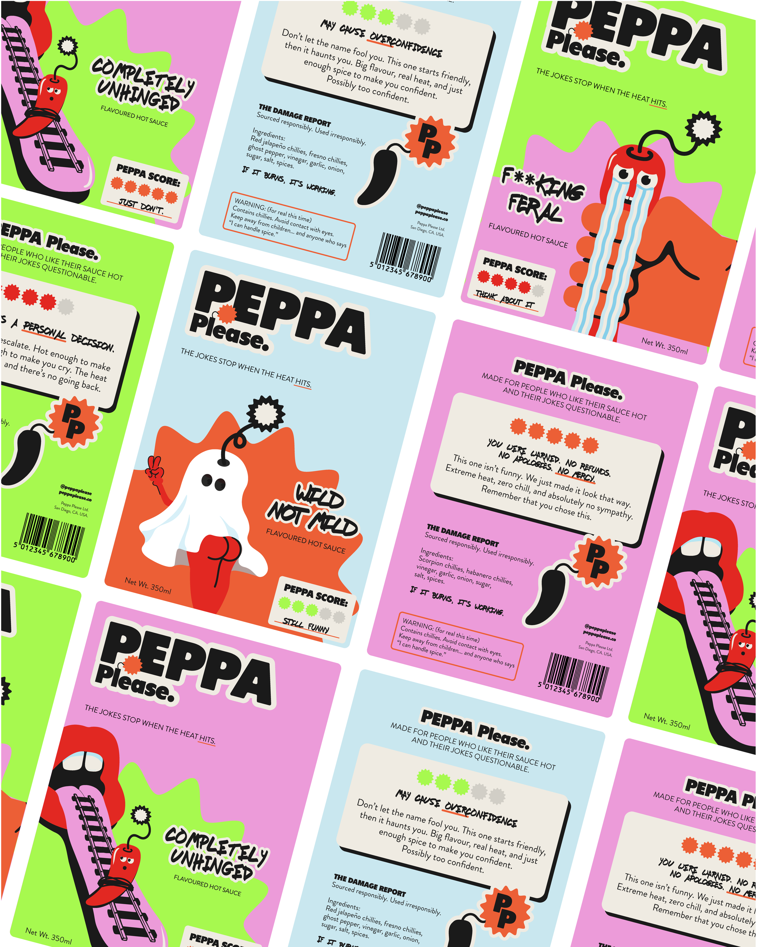
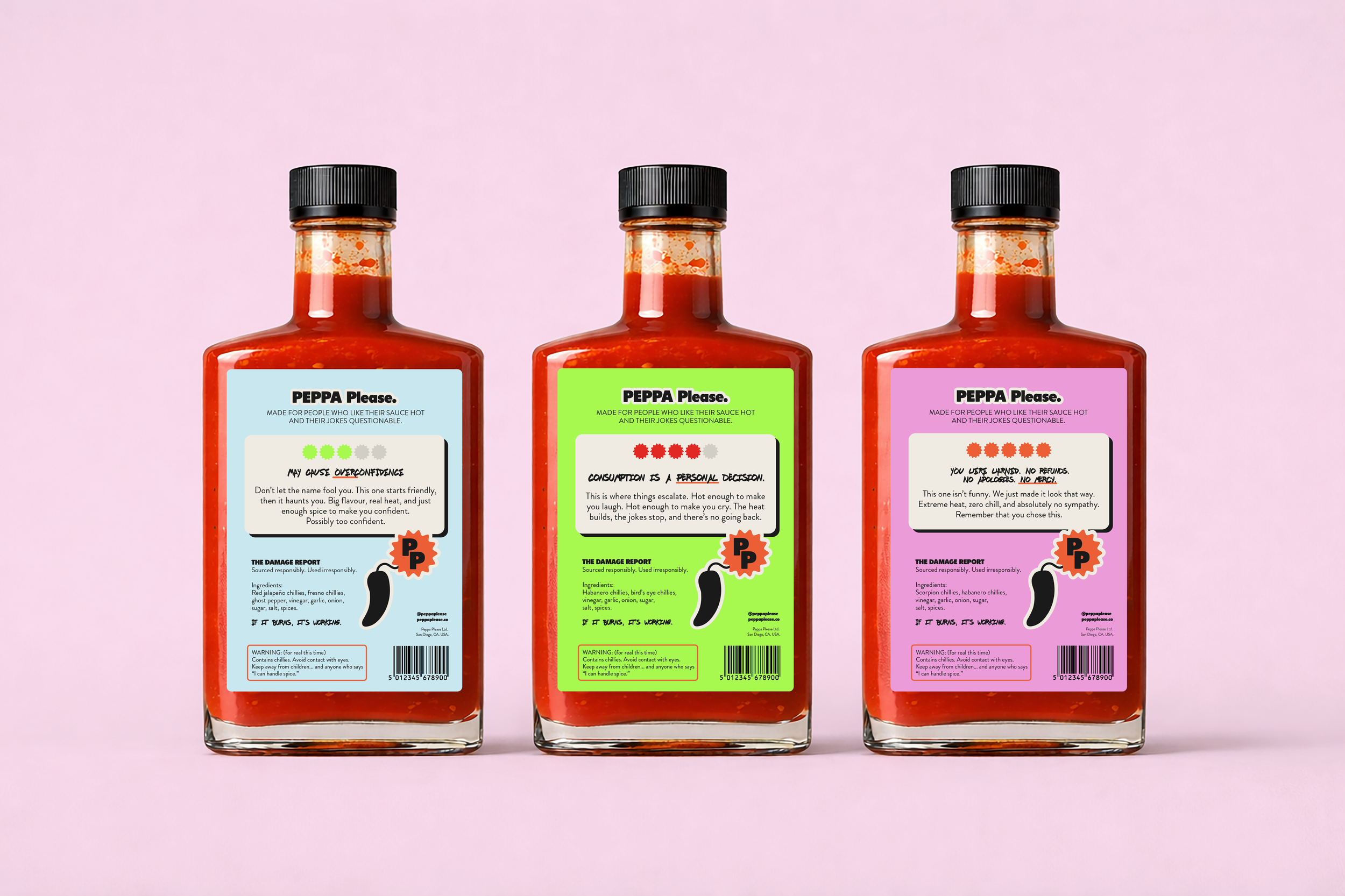
The BriefThe identity goes all in on bold colour, playful chaos, and visual punch. A stacked sans-serif logo anchors the brand, with the L in “Please” reimagined as a stick of dynamite (also seen as the brandmark). Vibrant colours, custom illustrations, and jokey language work together to land the joke fast - before the heat takes over. Three illustrated characters represent different heat levels, supported by score stickers and graphic-led ads that use dynamite, milk bottles, and visual punchlines to build a loud, recognisable brand world.
The SolutionA fearless brand system that’s impossible to ignore. Peppa Please stands out visually, lands the joke fast, and delivers on flavour when it counts. It’s playful, loud, and memorable - with a clear message: the branding may be funny, but the heat is not.
The Outcome