
KadoServices: Brand Identity • Logo Design • Packaging Design • Product Design • Art Direction • Print Design • Brand Collateral
Industry: Food & Beverage • Condiments • Luxury Food • LifestyleA refined, design-led brand identity for Kado, a premium Japanese-inspired soy sauce brand that transforms an everyday kitchen essential into a considered ritual.
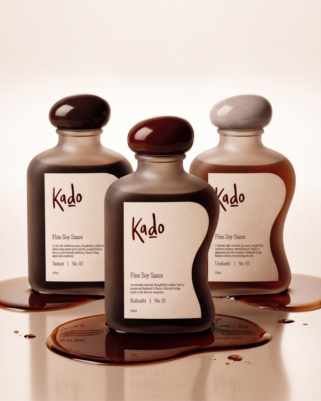
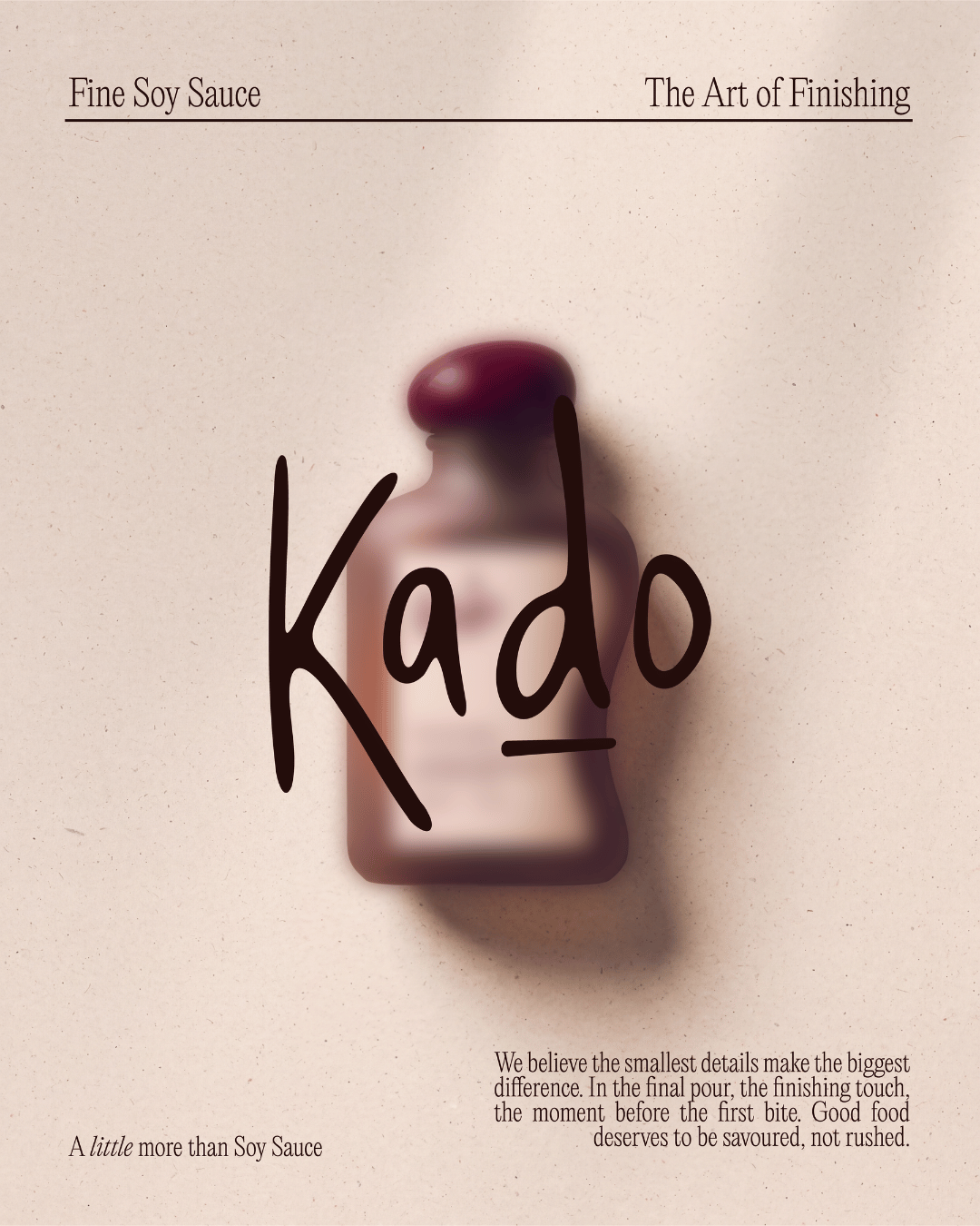
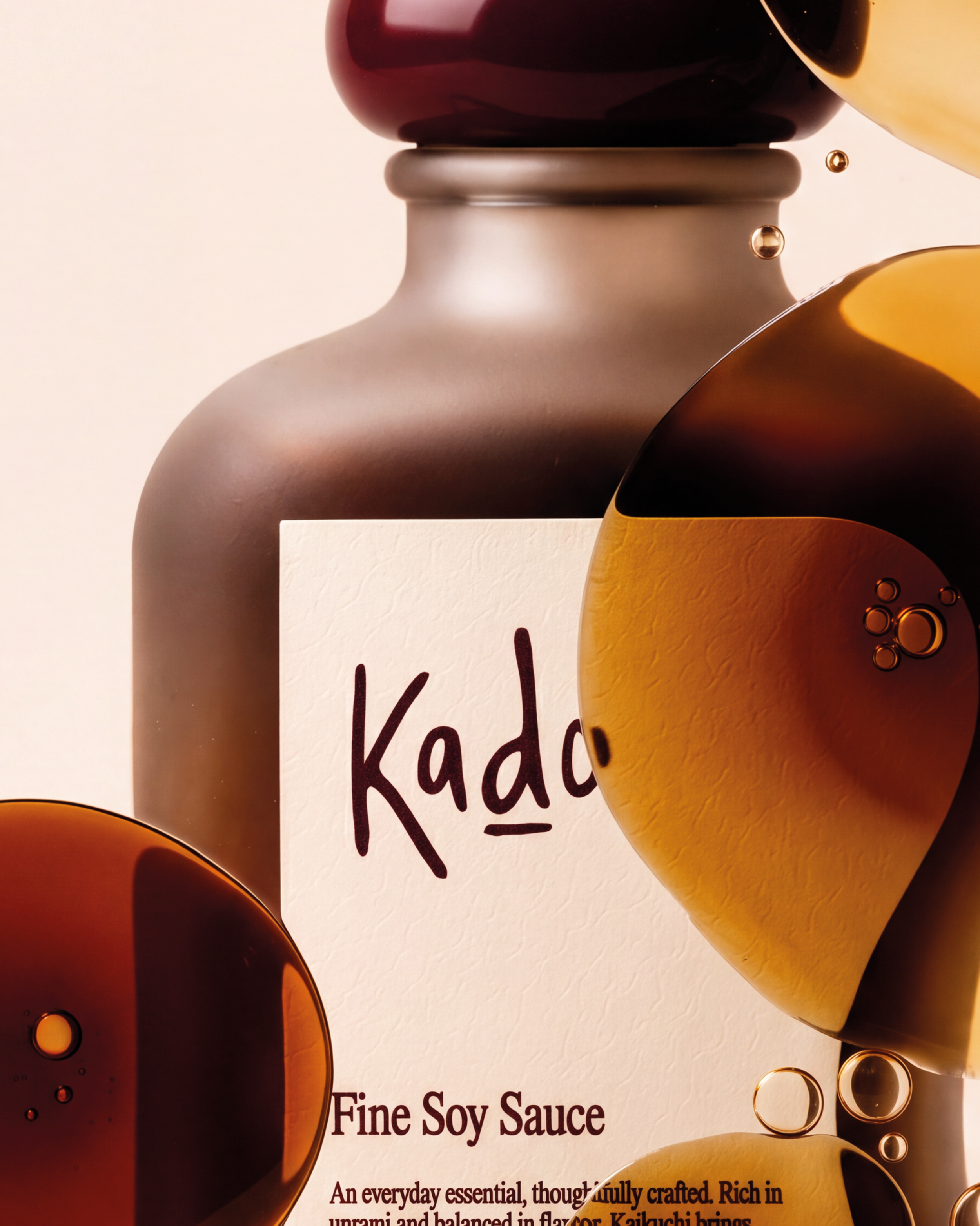
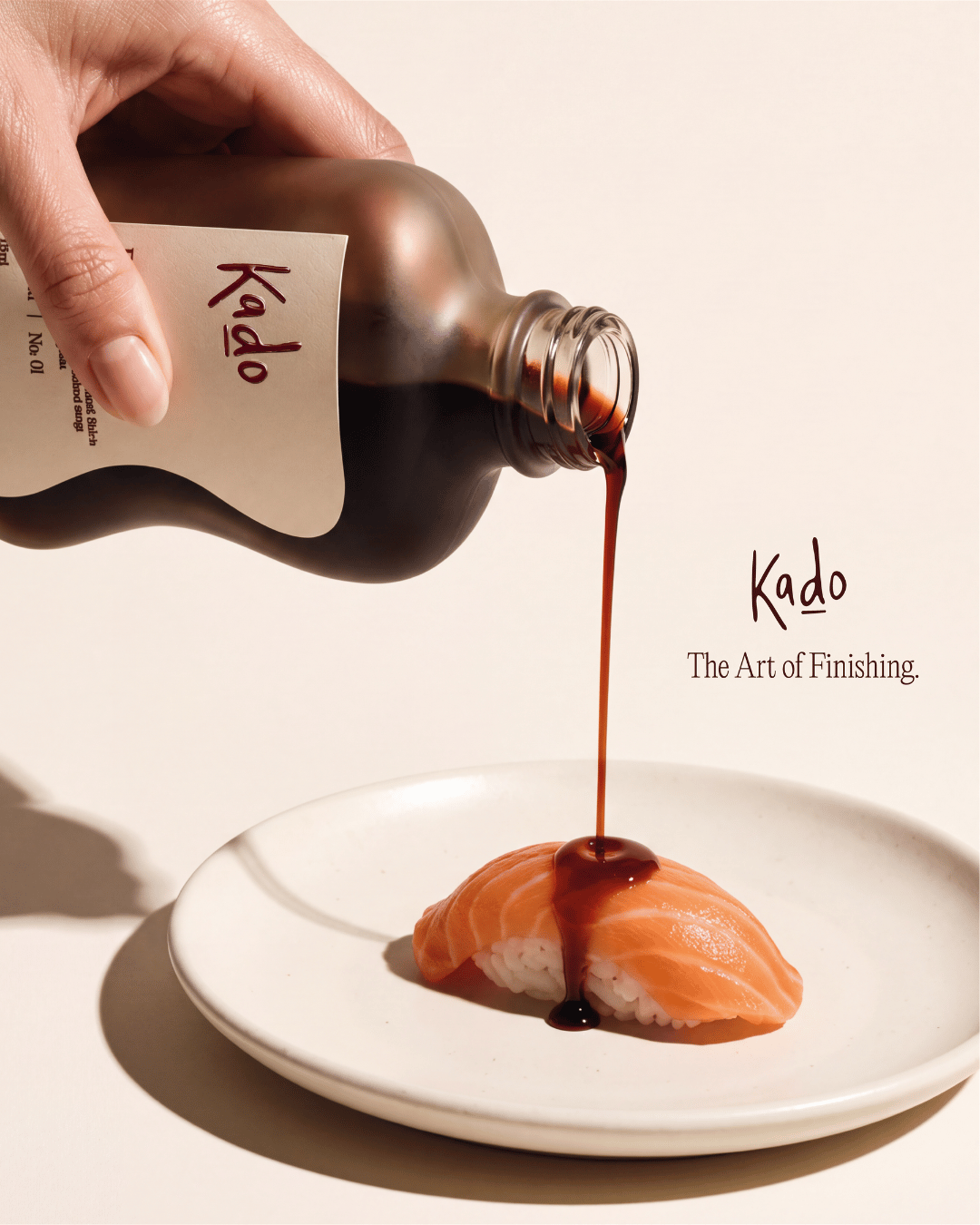
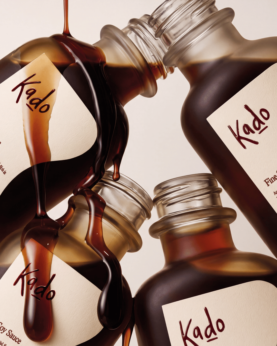
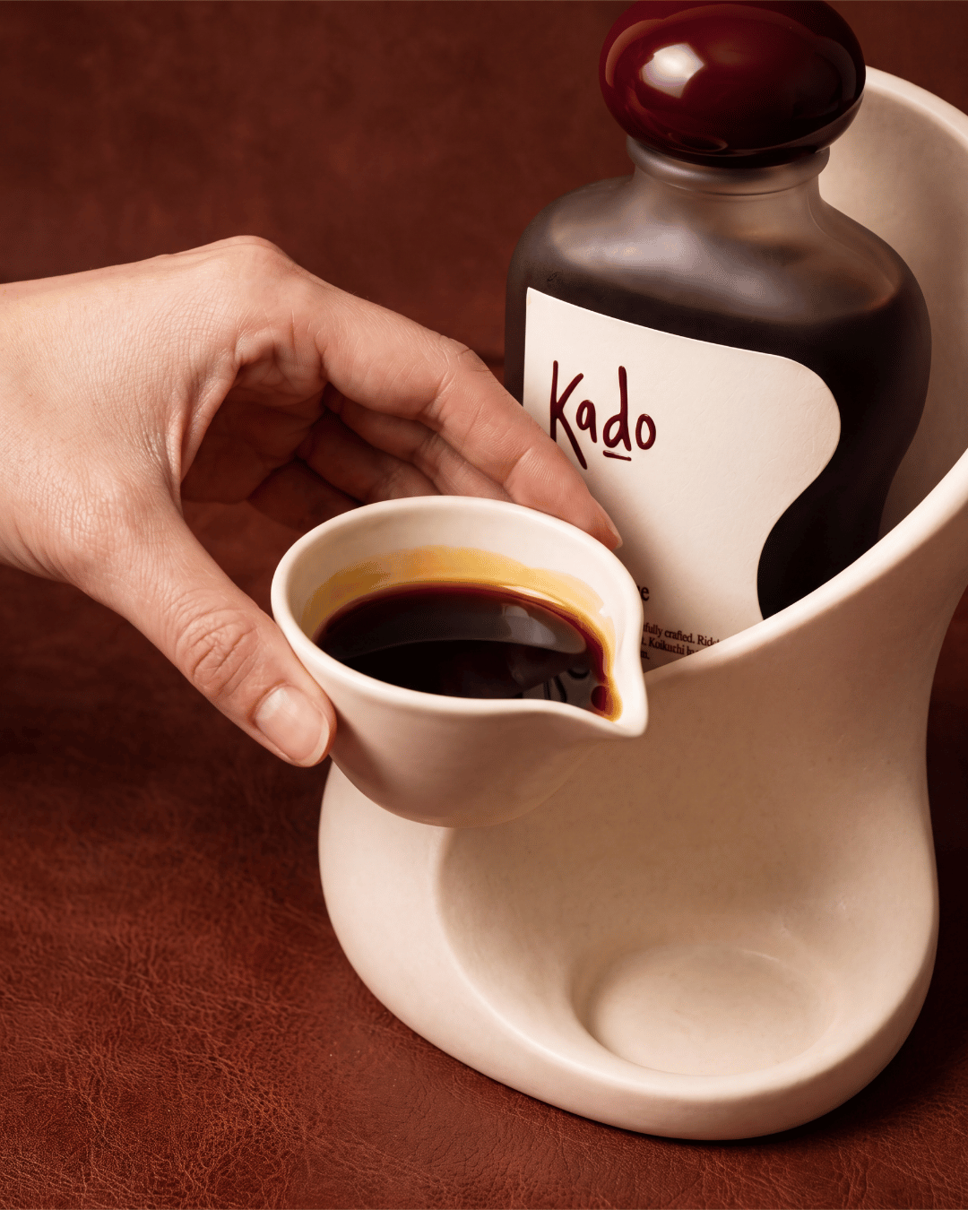
To reimagine traditional soy sauce packaging for a contemporary, design-conscious audience. The challenge was to elevate an everyday condiment into a desirable object, balancing Japanese-inspired minimalism with distinctive product design, practical functionality and a premium visual identity.
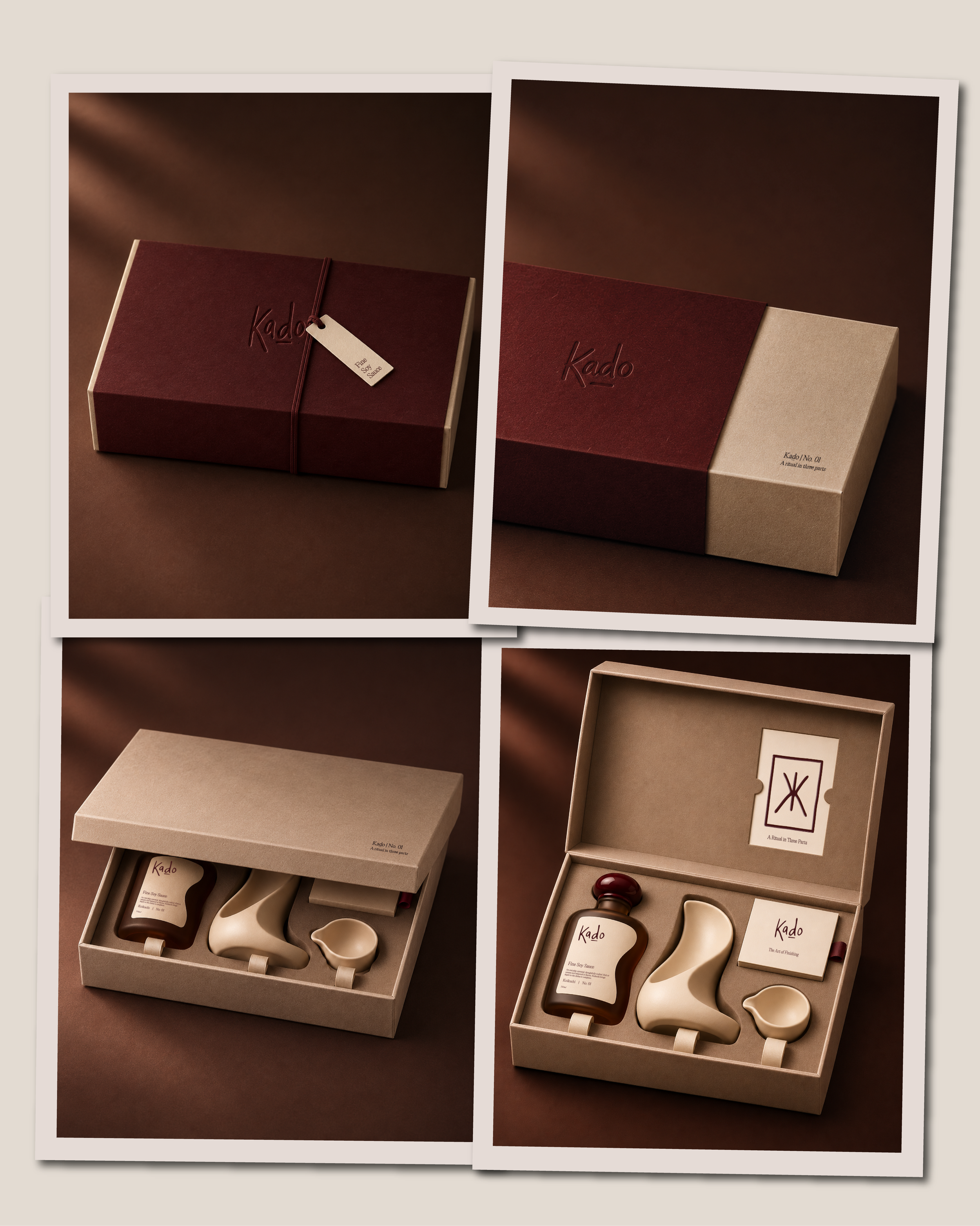
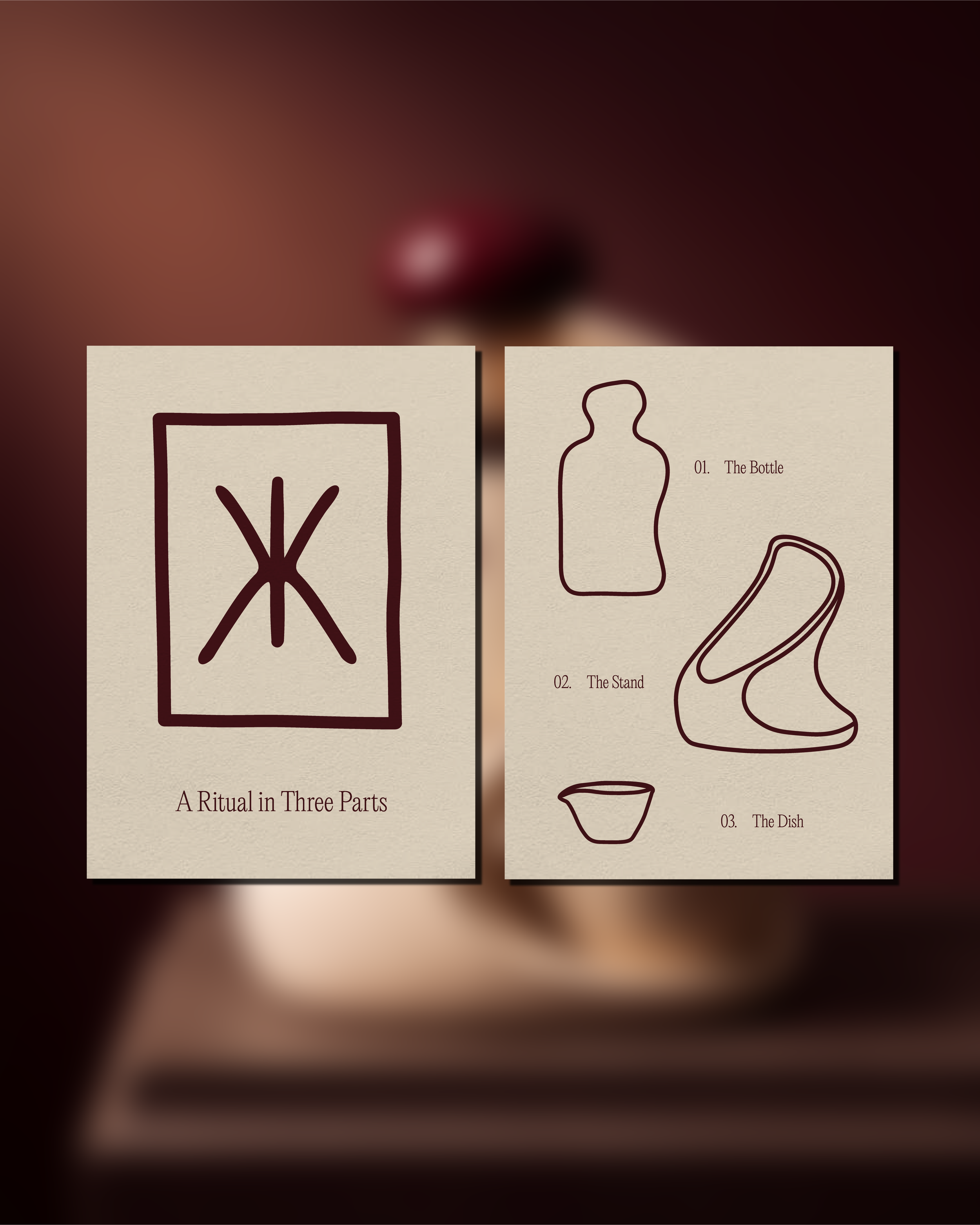
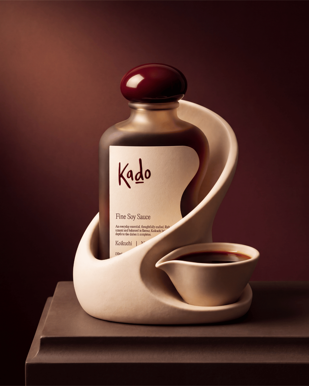
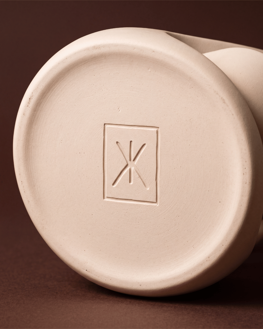
The BriefThe SolutionA minimalist identity built around sculptural forms, restrained typography and a rich palette of ivory, oxblood and deep brown. At its centre sits a bespoke glass bottle with a spherical lid, accompanied by a sculptural stand and removable pouring dish that fit together as one cohesive object. Thoughtful packaging finishes, including blind embossing and spot UV, extend the tactile experience, while a three-part product ritual reinforces the relationship between form and function.
A cohesive brand and product concept that transforms soy sauce from a cupboard staple into a statement piece for the dining table. Every element, from the bottle's silhouette to its accompanying packaging and printed collateral, works together to create a distinctive, elevated experience. Kado demonstrates how considered design can turn an ordinary everyday product into something worth displaying, using and keeping.
The OutcomeLove this style?
If you're looking for branding that feels just as intentional, let's chat.