
Two Rivers
Services
Brand Identity • Logo Design • Brand Strategy • Creative Direction

Industry
Wedding Venue • Hospitality • Events
A considered brand identity for Two Rivers, a wedding venue where historic architecture meets a new chapter. Rooted in the chapel’s character and the area’s mining heritage, the identity brings together meaningful details, refined typography and a palette drawn from its surroundings..
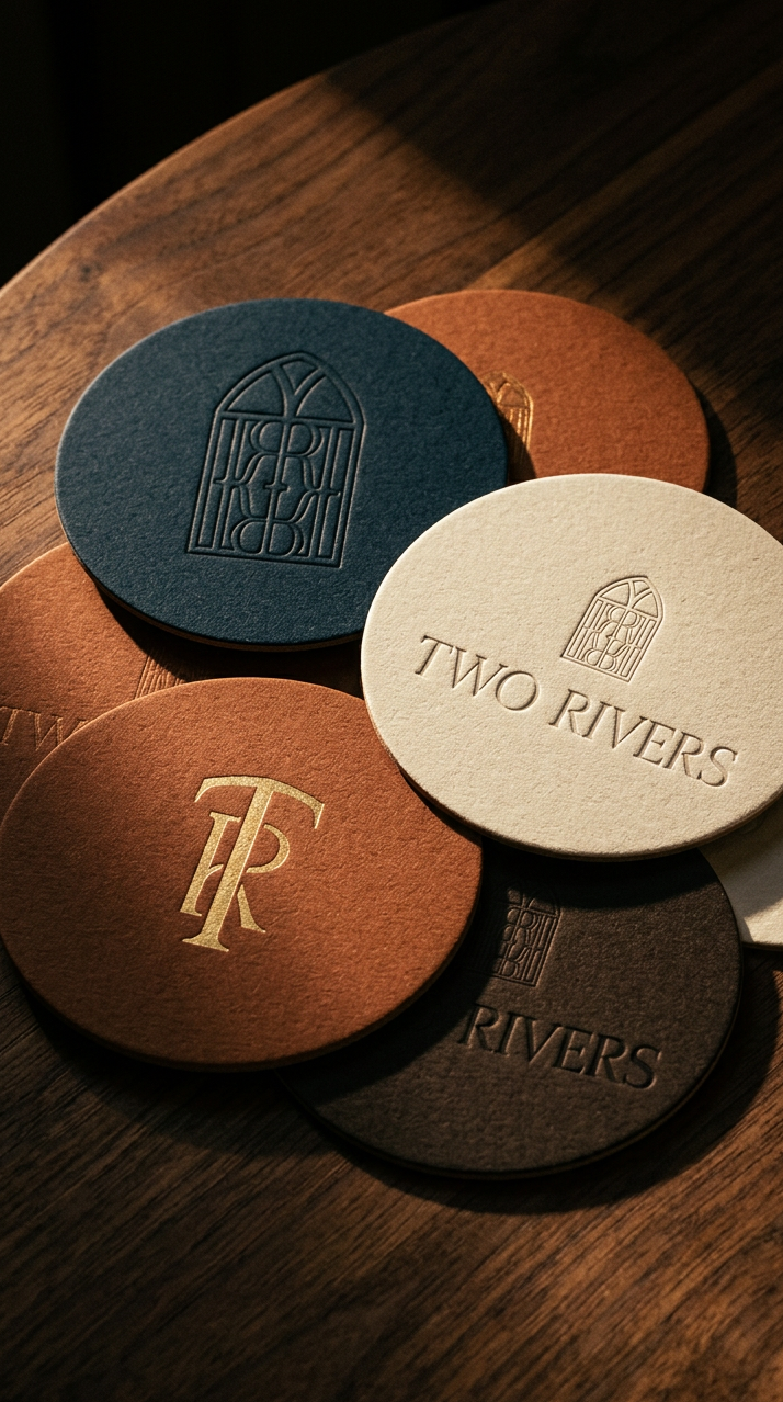
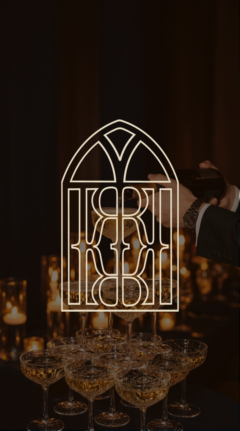
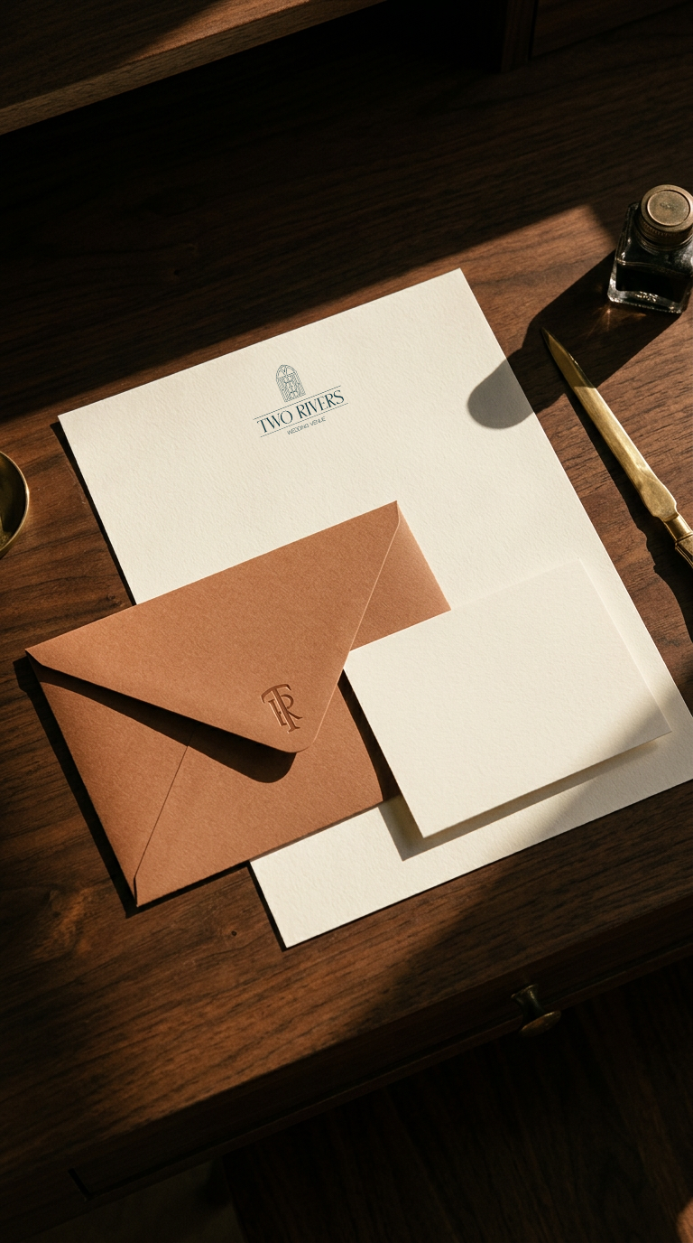
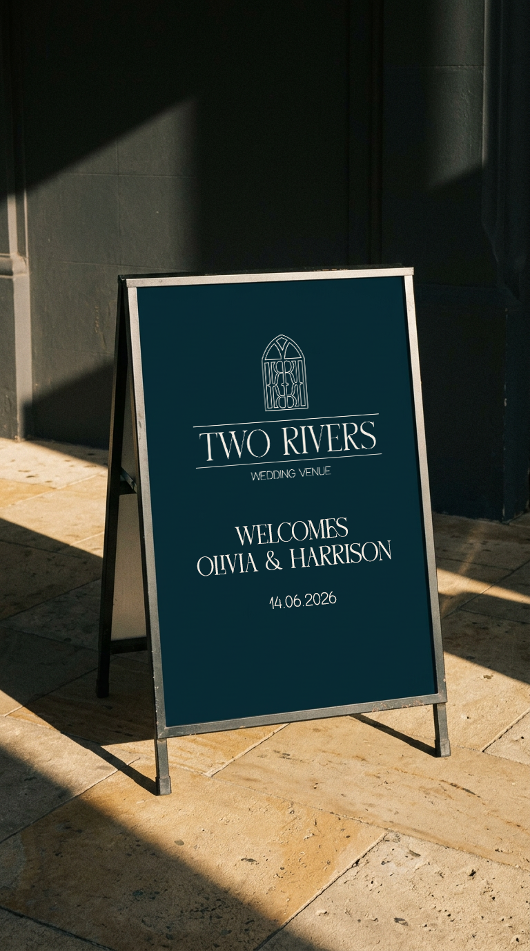
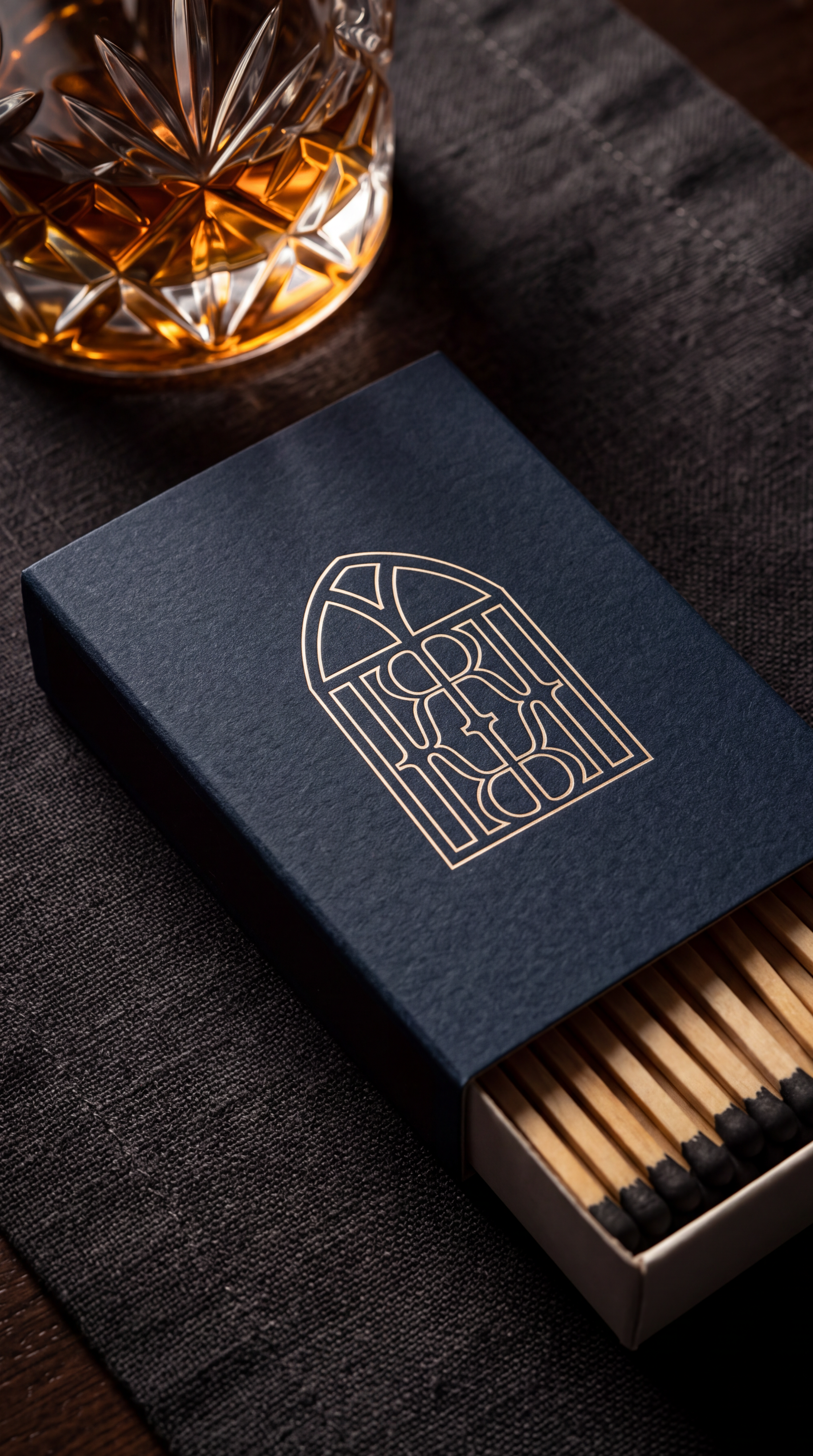
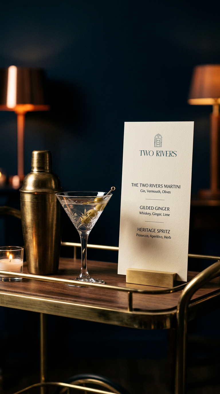
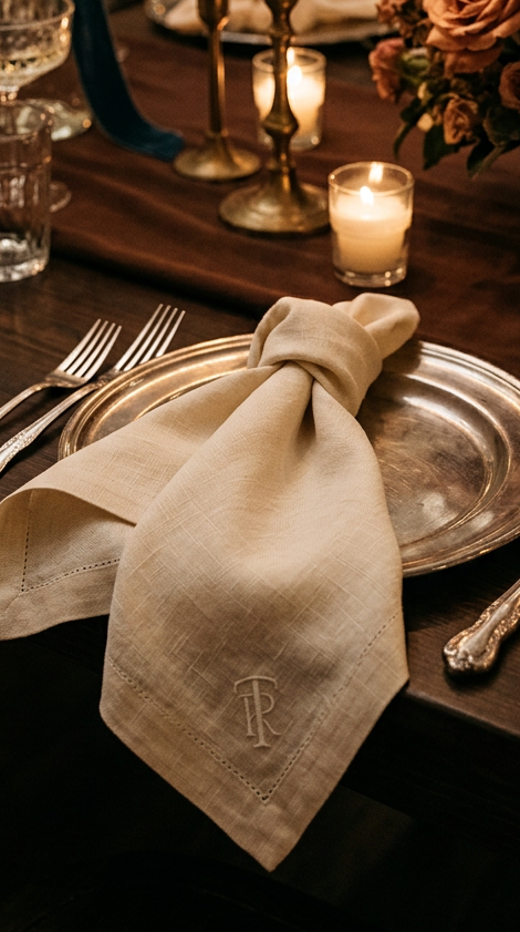
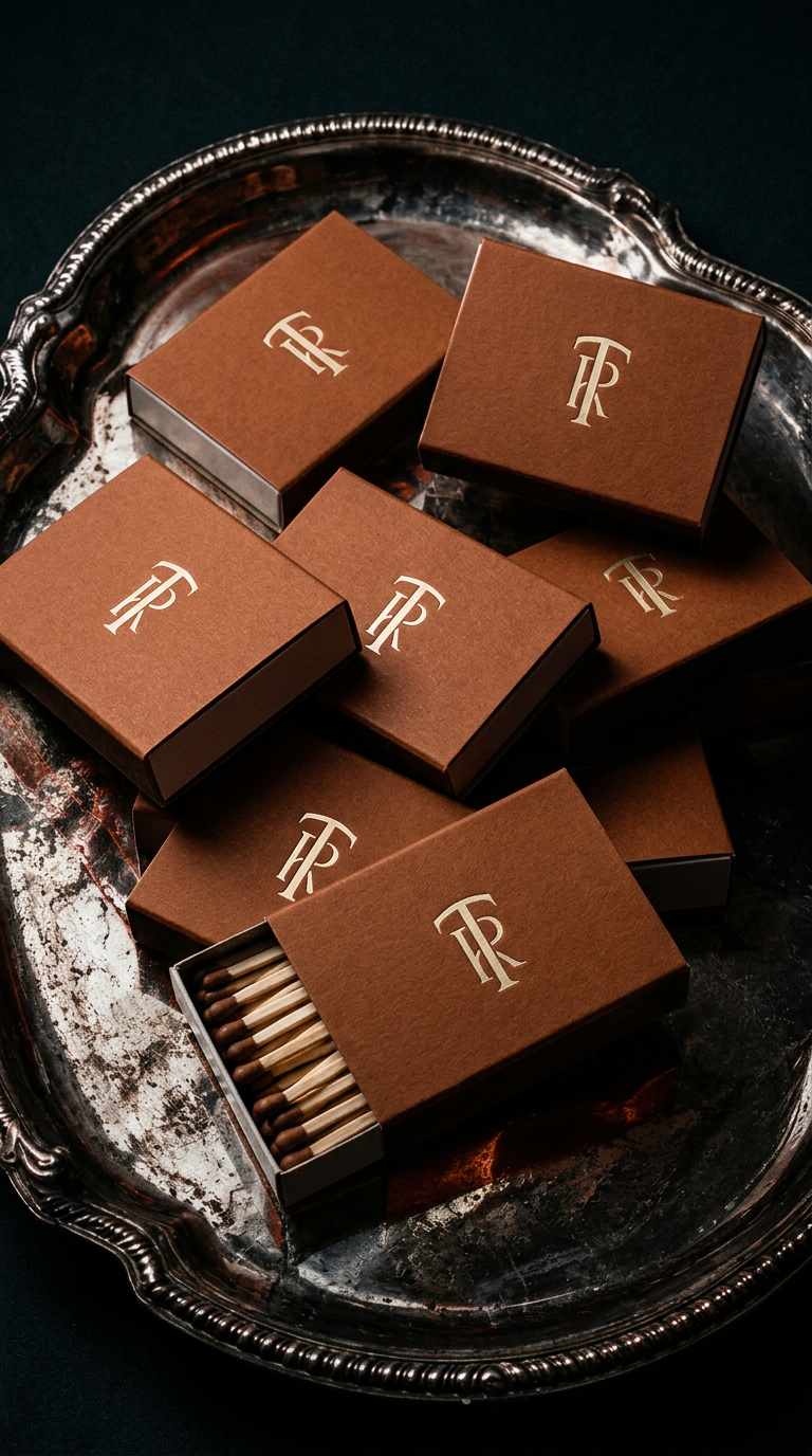
Create a distinctive identity that honours the venue’s history while welcoming the celebrations still to come. The branding needed to capture the chapel’s warmth and architectural character, giving Two Rivers a cohesive visual presence that feels romantic, established and personal.
The BriefThe SolutionThe identity centres on a mirrored T and R monogram, bringing the venue’s initials together in a distinctive, balanced mark. Its form also revealed an unexpected connection to the area’s mining heritage, adding another layer of meaning. An accompanying arch motif takes its shape from the chapel doorway, grounding the identity in the building itself. Refined serif typography pairs with an expressive script to balance structure and romance. The palette draws on copper, river tones, timber and soft plaster, connecting the brand to the venue’s landscape, materials and history.
A cohesive, flexible identity with a strong sense of place. The monogram, architectural motif and complementary typography give Two Rivers a recognisable visual language that can carry across its website, signage, stationery and venue details.
The OutcomeLove this style?
If you're looking for branding that feels just as intentional, let's chat.